Knitting Samples
September 15th, 2013
While attempting to clean up my studio (and organize my life enough to begin tending this blog again), I ran across a set of knitting samples I made earlier this year. They are fun but useless, so I decided to throw them away. But had to take pictures first.


The patterns are all modern of course, though most knitting patterns today are based on historical precedents. Except maybe giraffe print jacquard.
Go Blow Your Nose
July 15th, 2013
It all started with a Father’s Day present . . . a half-dozen monogrammed handkerchiefs, using embroidery directions and an alphabet from The Complete Encyclopedia of Needlework, by T. de Dillmont, 1884. It took a few tries to really get the hang of it, but then I was hooked.
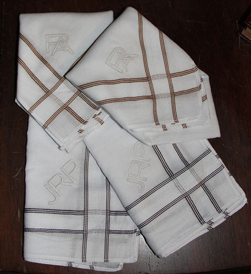
So I began combing my address book for other gents known or suspected to use old-fashioned cotton hankies. And coincidentally (if you believe in coincidence) I just happened to be rereading Ulysses, from whence this gem at the beginning of “Telemachus:”
Buck Mulligan frowned at the lather on his razorblade. He hopped down from his perch and began to search his trouser pockets hastily.
–Scutter! he cried thickly.
He came over to the gunrest and, thrusting a hand into Stephen’s upper pocket, said:
–Lend us a loan of your noserag to wipe my razor.
Stephen suffered him to pull out and hold up on show by its corner a dirty crumpled handkerchief. Buck Mulligan wiped the razorblade neatly. Then, gazing over the handkerchief, he said:
–The bard’s noserag! A new art colour for our Irish poets: snotgreen. You can almost taste it, can’t you?
He mounted to the parapet again and gazed out over Dublin bay, his fair oakpale hair stirring slightly.
–God! he said quietly. Isn’t the sea what Algy calls it: a great sweet mother? The snotgreen sea.
What’s more appealing than a neatly monogrammed, snotgreen noserag?
Pearls
May 17th, 2013
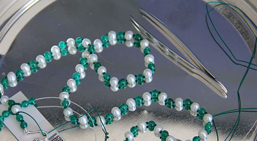
I taught myself to knot pearls about 7 or 8 years ago, and have indulged from time to time ever since. I’m not good enough, or fast enough, to do it professionally, but it’s a dandy way to make special-occasion gifts. In keeping with my penchant for doing everything the hard way, I’ve so far eschewed all of those “easy-knot” tools and prefer to work with just a pair of tweezers. Blister guards for my fingers might not be a bad idea though…
Sarah Cooper, Animal Life: In The Sea and On The Land (New York: Harper & Brothers, 1887)
Borrowed from Clip Art Etc.
My current project involves natural colored freshwater pearls and polished green agate beads strung on green silk. I think they’d hang a little more smoothly if I hadn’t decided to double knot, but I love the way the big knot looks. Ah well.
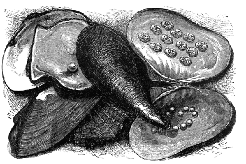
Ancient Ideas On the Origin and Virtues of Pearls.
Excerpt & illustration from Pearls and Pearling Life, Edwin William Streeter, 1886
“And precious the tear as the rain from the sky,
Which turns into Pearl as it falls in the sea.”—Thomas Moore.
. . .
The most wide-spread notion respecting the origin of Pearls, as briefly mentioned in our introductory chapter, is that which regards them as formed by dew and rain received into the gaping shell of the Pearl-oyster. This explanation of their origin is well set forth by Pliny, whose passage on the subject is thus quaintly rendered into English by old Dr. Holland:—“This shell-fish, which is the mother of Pearle, differeth not much in the manner of breeding and generation from the oysters, for when the season of the yeere requireth that they should engender, seeme to yawne and gape, and so doe open wide; and then (by report) they conceive a certaine moist dew as seed, wherewith they swell and grow bigger and when time commeth, labour to be delivered hereof; and the fruit of these shell-fishes are the Pearls, better or worse, great or small, according to the qualitie and quantitie of the dew which they received. For if the dew were pure and cleare which went into them, then are the Pearles white, faire, and orient; if grosse and troubled, the Pearles likewise are dimme, foule and duskish; pale (I say) they are, if the weather were close, darke, and threatning raine in the time of their conception. . . ”
. . .
We can well imagine that so chaste and charming a gem as the Pearl should be deemed worthy of a more sacred birth than that arising from a drop of common rain or dew, and hence arose the highly poetical idea that Pearls were formed from tears wept by angels, or shed by mortals under circumstances of peculiar trial. Thus, in “The Bridal of Triermain,” Sir Walter Scott writes :—
“See the Pearls that long have slept,
These were tears by Naiades wept.”So Shakespeare finds a similar idea in the
following lines:—
“The liquid drops of tears that you have shed,
Shall come again transformed to Orient Pearl,
Advantaging their loan with interest,
Of ten times double gain of happiness.”

Opening oyster shells on a pearling ship.
Coincidentally (if you believe in coincidence), I’ve been obsessing on the duet from Bizet’s Pearl Fishers. I’m learning to play the baritone part on my cello since no one will sing it with me. I guess it’s just as well, until I learn to hit that high B flat without breaking glass…
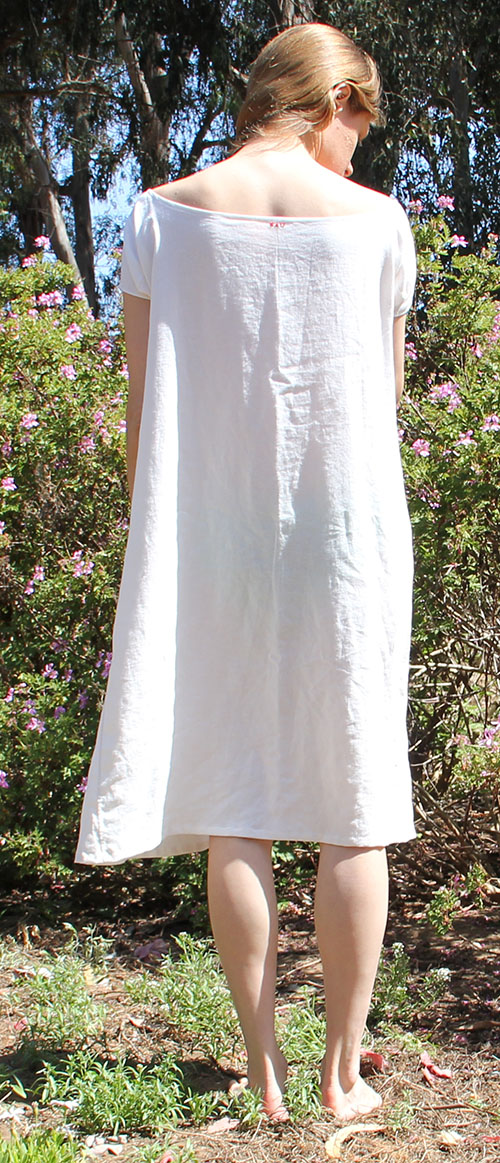
HSF #3: Under it All
May 14th, 2013
Boy is this a belated post. The deadline for this challenge was February 11. That’s MONTHS ago. Oops. But here it is in the spirit of better late than never (when you try to juggle as many things as I do, this becomes one of your favorite phrases)…
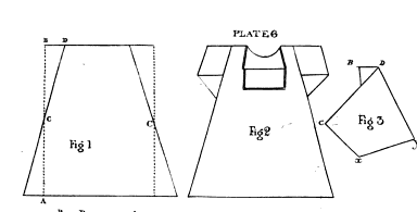
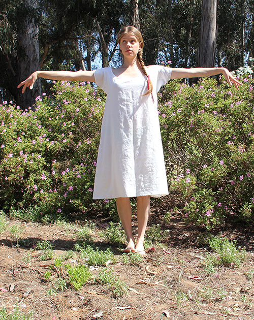
I made a early-mid-19th century shift exactly by the book. That is, following the directions in the Workwoman’s Guide (1838) to the letter. I mostly used the written directions and measurement charts, but it’s nice to have illustrations for reference as well, like plate 6, shown here. Don’t worry if you can’t find the illustrations when you read the Guide on Google Books — they’re all at the end.
After a little hesitating, I decided to break into my stash of NYC linen. I selected a piece with a fairly loose weave — not at all historically accurate, especially since the warp is made of much tinier threads, throwing the balance completely off. But it seemed like the best approximation of the “stout linen” recommended for shifts “for poor children.” (I realize that makes no sense at the moment, but I’ll explain what I’m working on eventually.)

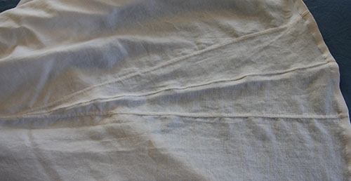
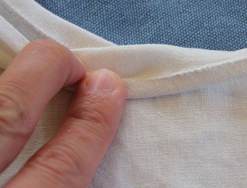
The fabric was 60 inches wide, give or take a few after I shrunk it twice, so I was able to cut it in half and scrape out enough to make two shifts in the “first size” (aka smallest) with a single length. I cut it “to a thread,” which is the laborious process of pulling out a thread and cutting along the empty line to make sure you stay on grain — alas, linen cannot be torn like cotton. Then folded my length of fabric at the shoulder and basted up the selvedges so they’d stay together as I cut off the gores (see figure 1).
I was reminded how tricky gussets can be when you’re sewing and felling. I’ll admit here that I completely messed up the first sleeve. A quick refresher from a selection of mid-19th century sewing manuals helped me get the second sleeve nearly perfect.

Once I’d cut out all the pieces — which was pretty easy since they were just rectangles — it went together very quickly. The edges were simply hemmed, with the exception of the neckline, which got double-turned and sewn for extra strength.
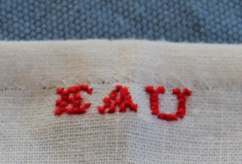
I forced myself to mark the shift at the back neckline with red embroidery thread. Workwoman’s Guide doesn’t mention ink in its section on marking, so I gritted my teeth and made with the magnifying glass. I opted for only my initials since using the current year would look funny, and it didn’t feel right to lie about the year either. I mean, with all that hand-sewing and accurate construction, it might get mistaken for an antique, right?
I was a little nervous about making the smallest size. I mean, I may be fairly trim for a 21st, century person, but I’m also half a foot taller than the average woman of 1850 and probably have a bigger — or at least longer — bone structure overall. I did end up adding 4 inches to the length, figuring that’s about how much extra length is in the part of my body covered by the shift. To my surprise, the shift is actually quite roomy. With the exception of the sleeves, which JUST fit my not-particularly-muscular upper arms.
The neckline is especially large. At first I thought I’d made a mistake. But my measurements were perfect. And then I thought there might be a drawstring coming later on in the directions. But nix on that as well. So I am left with three possibilities.
- Women in the mid-19th century were universally better endowed than myself (which isn’t surprising considering what I’ve noticed in the early 21st century).
- They made all their clothes really big because repeated washday boilings were bound to shrink them considerably.
- It’s time to reevaluate the way I interpret “fit” of historic undergarments.
Number 3, while it may seem unlikely, and definitely involves eating at least a sliver of humble pie, does fit with my experience recreating the Regency apron-front dress from Janet Arnold’s Patterns of Fashion I. It’s also supported by some of the paintings I’ve been working from for my latest project. And here I thought the artists were being salacious by portraying women with their shifts falling off their shoulders. But maybe they just slipped on their own…

Just the facts, Ma’am: Workwoman’s Guide Shift
The Challenge: #3: Under It All
Fabric: 60″ wide hopelessly modern linen with an unbalanced weave
Pattern: From the written directions and diagrams in the Workwoman’s Guide, 1838
Year: 1838 (this shape remains accurate through the mid 1850s)
Notions: 100% cotton thread, red cotton embroidery floss
How historically accurate is it? I’ll give it 95%. It’s entirely hand-sewn according to mid-19th century plain sewing directions, with attention to specific techniques for shift necklines and gussets from the Workwoman’s Guide and other sources. The construction is as accurate as possible given the width and weave of the modern fabric I had to work with. Because of the fabric, I had to sew and fell the gores onto the bottom of the shift body, whereas if I’d been using proper fabric, I would have sewn them selvedge to selvedge. This time I broke out my 100% cotton thread, along with the beeswax and lots of extra patience.
Hours to complete: Probably about 15. It’s hard to tell when you sew in odd moments, like before breakfast, or while you’re playing dummy at the bridge table…
First worn: This afternoon, to take pictures. It will ultimately figure in a much larger project that is currently stamped TOP SECRET (mostly because I love being dramatic).
Total cost: About $10. I don’t remember exactly how much I paid for the linen, but it was probably about $7 a yard. The cotton thread wasn’t cheap, but I barely made a dent in the spool.
Making Room for Kipling
May 6th, 2013
I’ve spoken out before this in favor of Rudyard Kipling; one of late-19th century Britain’s literary giants who has, alas, fallen somewhat out of fashion these days. His major crime, as far as I’ve been able to discern, is being a man’s man who grew up without the benefit of political correctness.

Admittedly, most of my fondness for Kipling stems from Stalky & Co., a vaguely autobiographical account of his public school career, very much in the spirit of Tom Brown, though rather more fun. I haven’t read too much of his other work — just dabbled a bit with Plain Tales from the Hills. Oh, and of course I had Just So Stories when I was a tot. But I’ve always meant to explore further, so you can imagine I jumped at the chance to acquire 7 matching volumes of assorted Kipling this afternoon at Phoenix Books in San Luis Obispo.
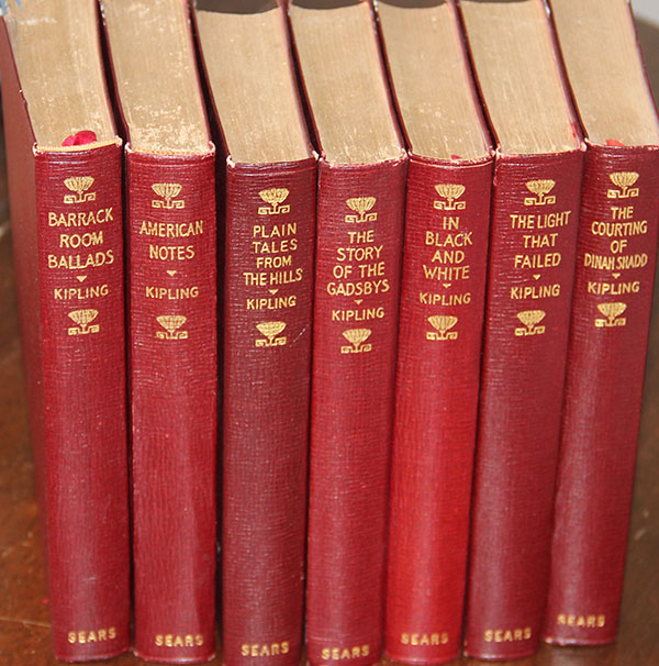
I love the edition — it’s undated, but I’m guessing 1910s or 20s. The publisher is J. H. Sears & Company, New York. They’re perfect for our 1920s redwood living room, and I couldn’t wait to see them next to J. M. Barrie on our “aren’t these bindings pretty shelf.” Alas, there doesn’t seem to be any room left. Perhaps some of the less decorative volumes will be willing to make way, though I’m not sure where they’ll go either — we seem to have books stashed in every little hidey-hole you can imagine.